Accru Partners – Website & Visual Identity
The Challenge
Accru Partners is a network of high-performance companies united by shared expertise and accumulated knowledge. The challenge was to create a brand-new website that not only launched their identity but also visualized their core values: trust, precision, and harmony. We needed to translate a previously developed brand identity into a digital presence that felt modern, minimal, and distinctive—a design system that could stand out in the world of finance while remaining timeless.
Creative Approach
Our UX/UI process began with exploration of form and function: how do we express numbers, logic, and collaboration visually without falling into corporate clichés? After iterations, we developed a visual language built on minimal, geometric shapes—drawing inspiration from Bauhaus geometry and Nordic minimalism.
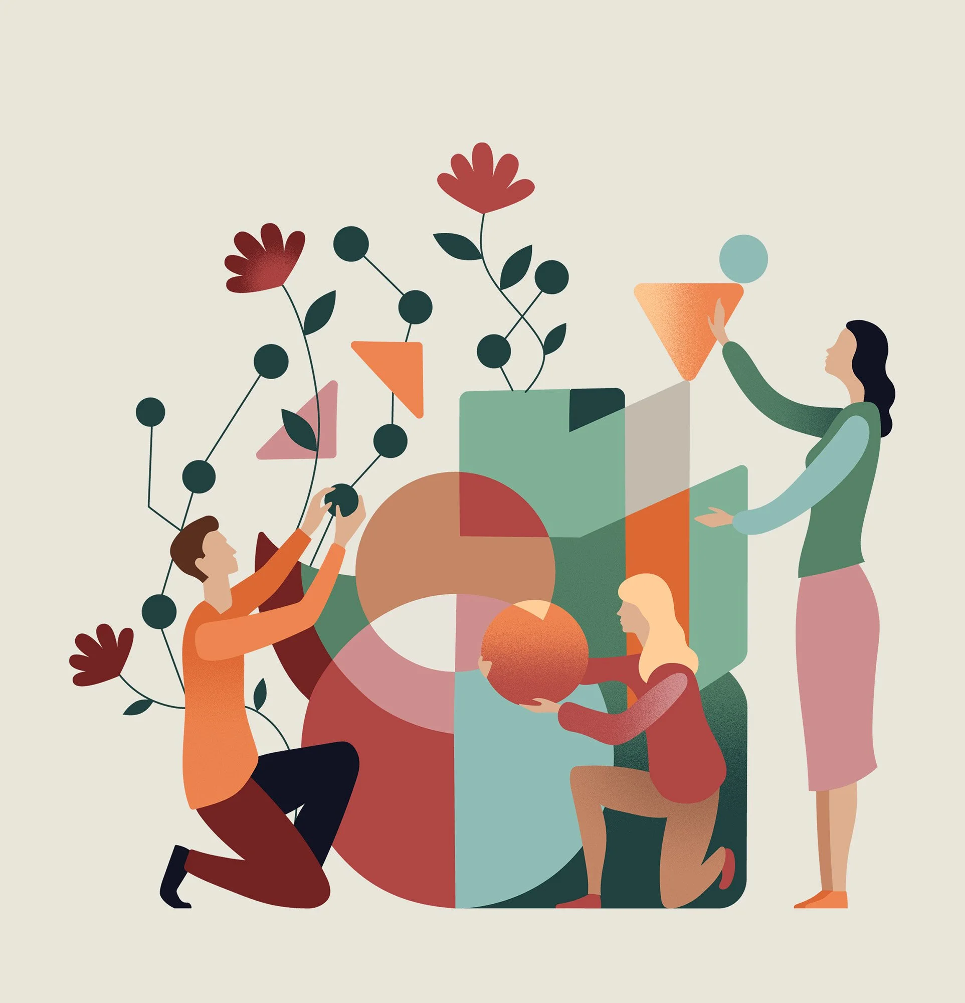
The resulting design is clear, structured, and quietly expressive. Shapes and illustrations act as metaphors for balance, growth, and interconnectedness—visualizing Accru’s ethos that strength comes from the synergy of its partners. Every design choice, from the grid to the typography, was built around precision and harmony, echoing the company’s role in uniting expertise.
The launch of accrupartners.com marked not only a website release but the unveiling of a new digital identity: a space where brand values, visuals, and user experience work seamlessly together.
Role: Look/Style Development · Illustration · UX/UI Visual Direction
Software: Figma · Illustrator · Pro-Create
Developed at advance.dk


From Exploration to Execution
The process began with low-fidelity sketches and structural explorations, focusing on how to translate Accru’s values into a clear, intuitive digital flow. These early sketches allowed us to quickly test ideas around navigation, hierarchy, and balance, ensuring the experience would feel effortless and precise.
From there, the concepts evolved into full-page layouts and hero screens, where the visual language of geometric forms and minimal design was fully integrated. The result is a website that feels both functional and expressive, carrying Accru’s brand identity seamlessly into the digital space.


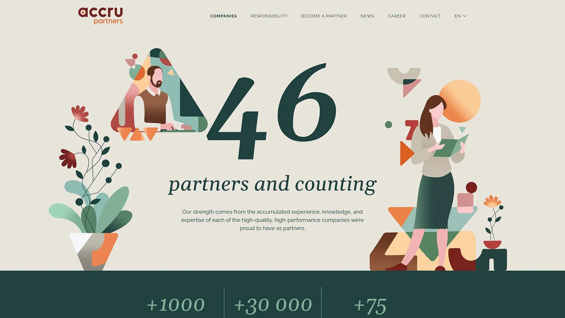
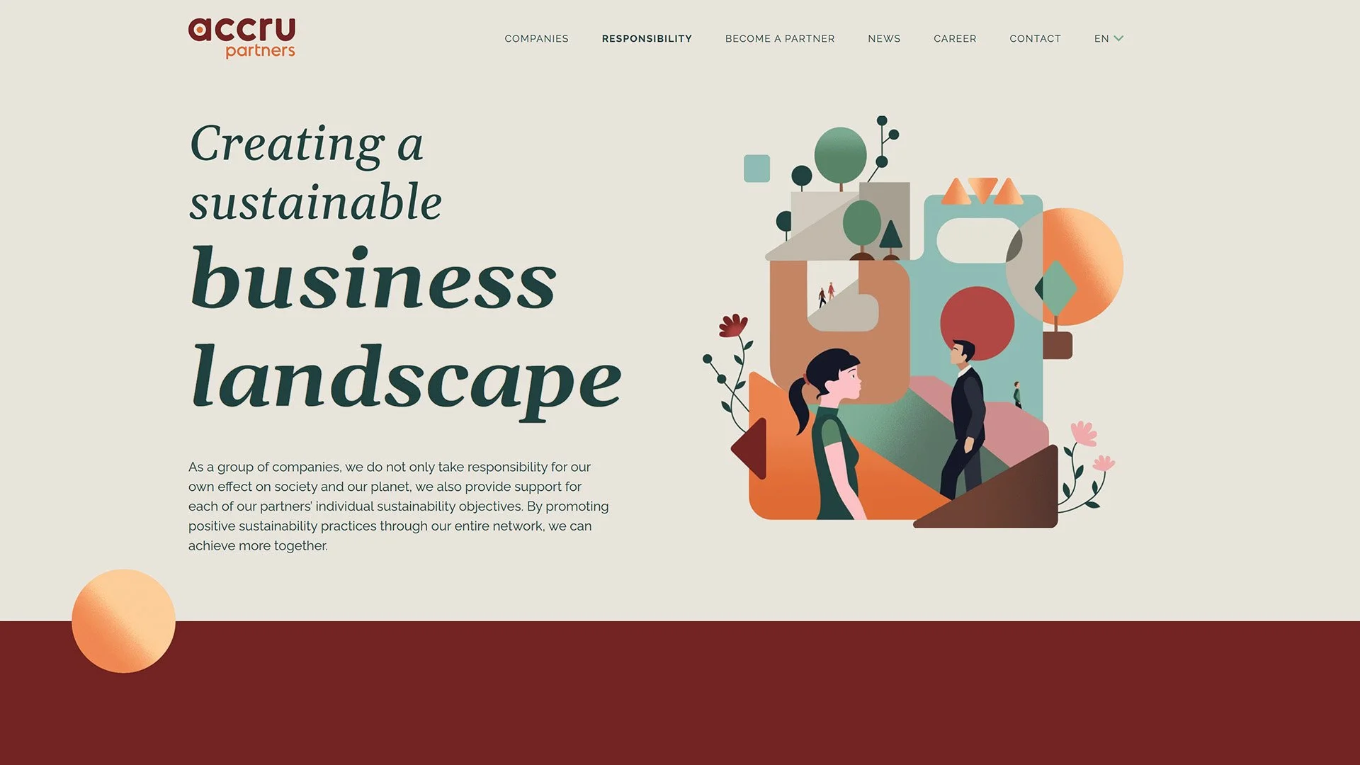


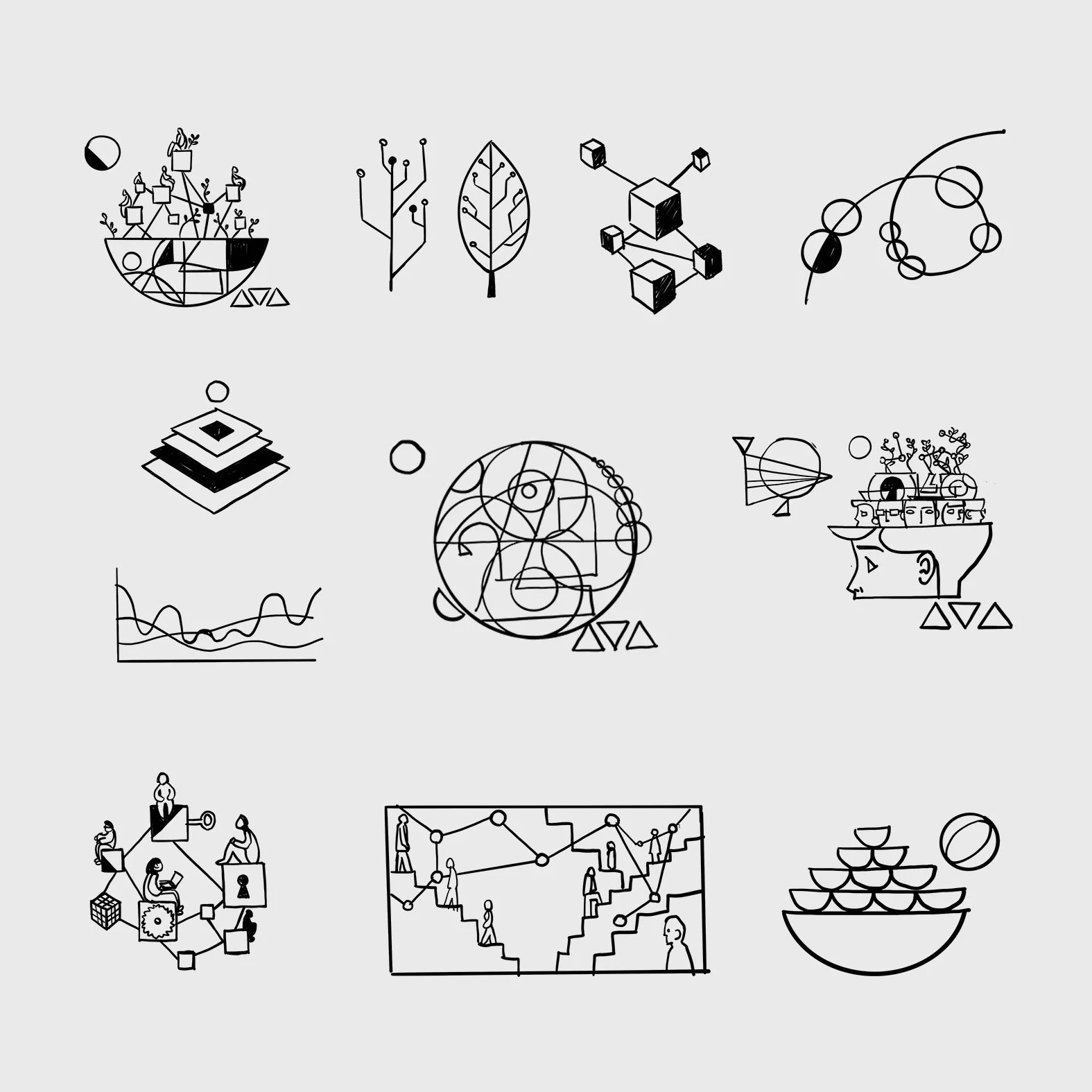
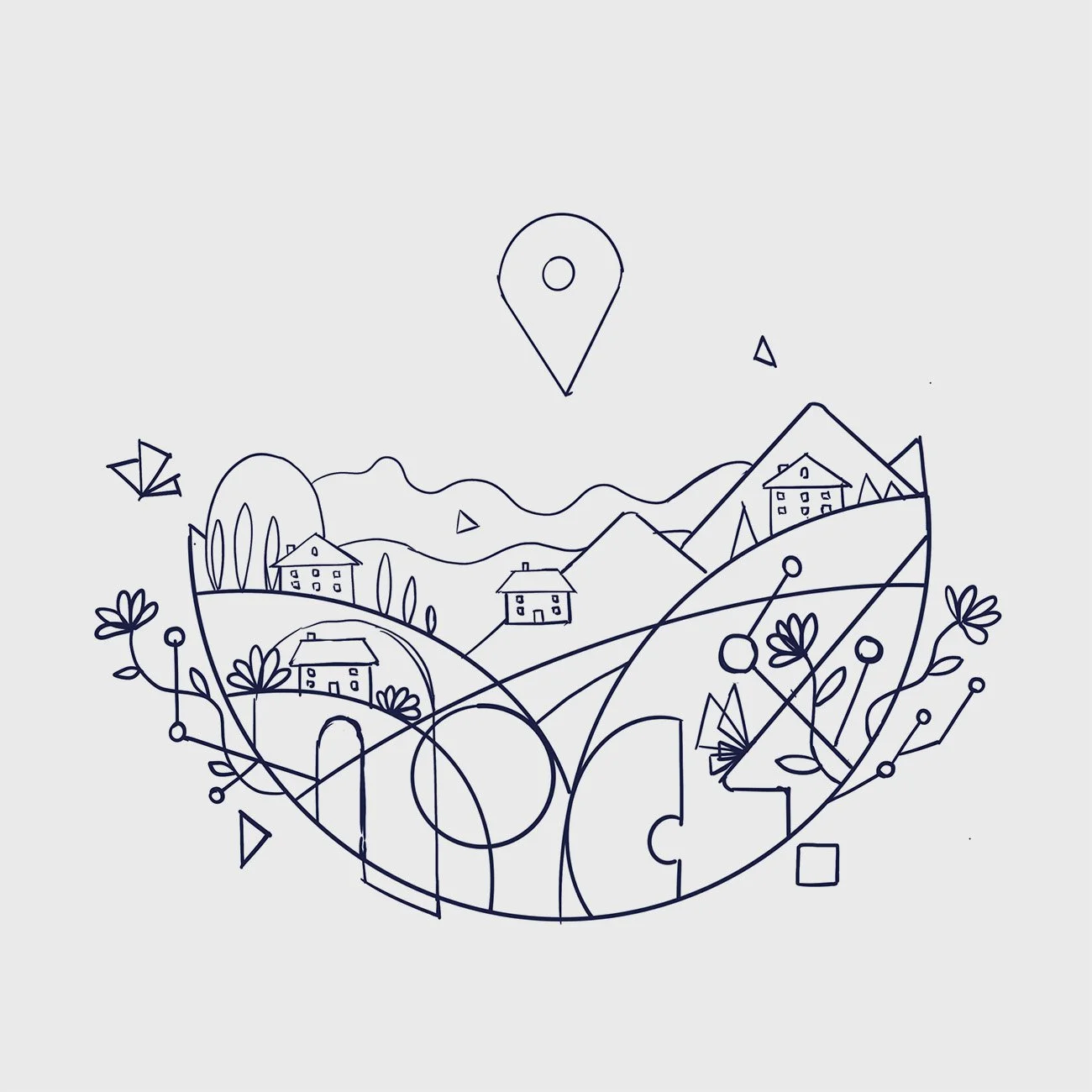
Illustration Exploration
The illustration system for Accru Partners was developed through a sketch-to-final process, starting with quick explorations of geometric forms, metaphors, and character ideas. Early drawings allowed me to test how abstract shapes could represent concepts like growth, collaboration, and structure, while still feeling warm and approachable.
From these initial sketches, the direction evolved into a refined illustration style that merges Bauhaus-inspired geometry with Nordic minimalism. The final artworks balance abstraction and human elements, ensuring that the visuals communicate both precision and harmony—the core values of Accru.
This style also proved to be rich for animation and future assets. The geometric and figurative forms—whether shapes, characters, flowers, or birds—were designed to come alive in motion, creating a visual language that feels at once digital and organic. This gave the brand a versatile system, adaptable across illustration, animation, and digital experiences.